Thriller Film Poster Analysis
Overall the poster design for thriller movies are very similar, The use very simplistic designs with little text and more of the background and actors faces, In conjunction to this they use contrasting colors such as black and red or white and blue. These colour’s help give the viewers the general tone of the film by just looking at the poster.
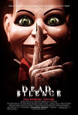
This is the first poster that we have looked at, the poster helps portray the genre of the film while also giving an insight about what the film is. With the focus on the doll we know that the film will be about a ventriloquist’s doll. Since the colour of the doll has a hint of red throughout it we can make the judgement that the film will involve scenes of violence, this judgement is reinforced by the text style that is used since it is common within the thriller and horror genre. The deep black colour in the image helps create mystery for the film as it pushes the viewers focus onto the doll and the hand that is covering the dolls mouth, the hand is shown with small rotten parts over the skin, this detail shows that the film is within the horror, thriller genre and will most likely have some form of death or undead characters.
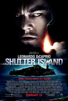
This is the second poster that we have looked at and analysed. The poster shows half of the main actors face (Leonardo Dicaprio) which represents that the film will hold back some information on the origins of the character. This creates mystery around the whole movie and doesn’t give you a good insight on what the character is or what he does. The small island in the background resembles an offshore prison/holding facility. This gives the viewers the idea that the film will be based around the police force or detectives that are working to solve a case. The off shore island represents the idea of being isolated from society and in conjunction with the image of the man’s face we can make the assumption that the main character is fighting his own battles throughout the film. The quote ‘some places never let you go’ gives us the idea that they are stuck on the island and the main character is not allowed to leave.
In conclusion many thriller posters follow the same style of hiding the main plot line well but still giving the audience information about what the film will be based around. Using this information our poster design will follow the same design of showing small parts of the story without giving away excessive information on what will happen within the film.


